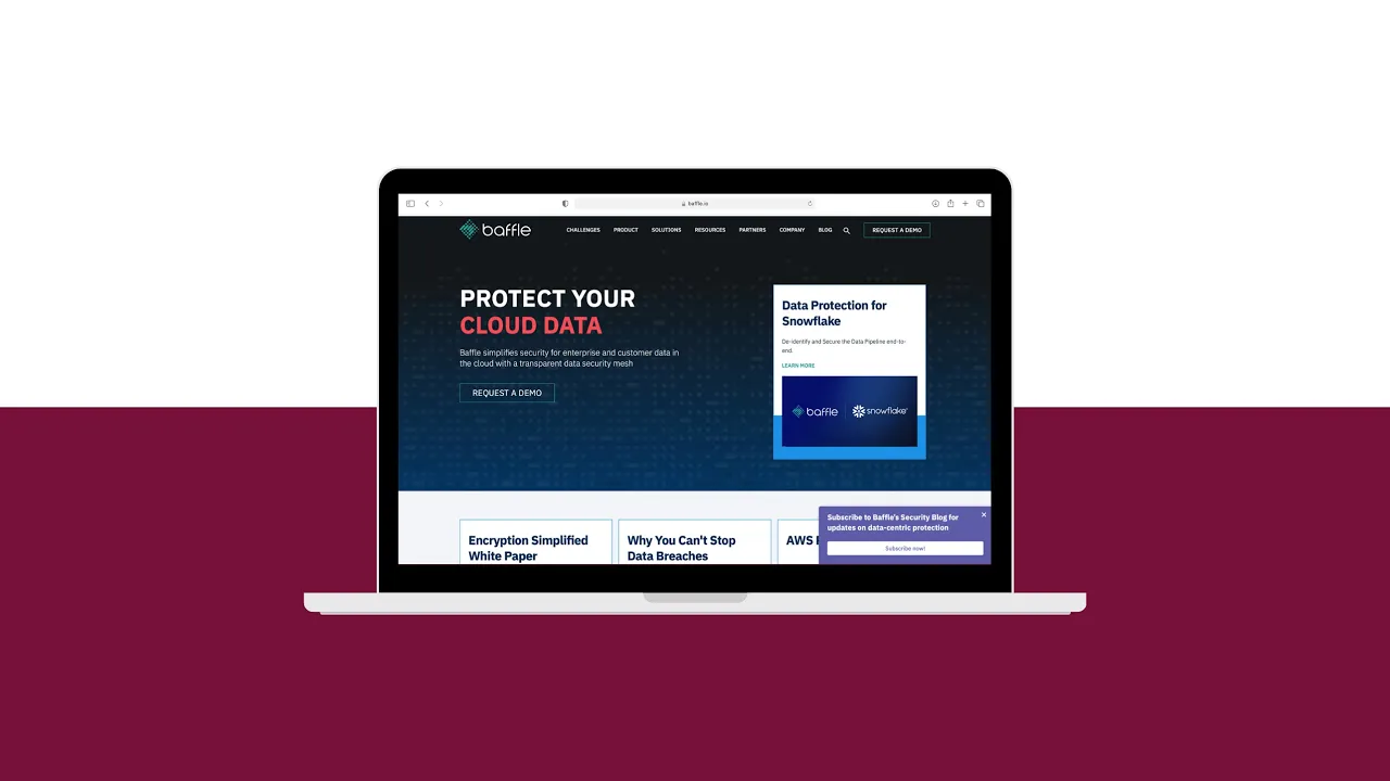
1. Design Research & Immersion: Despite my title as Marketing Associate, my background in graphic design allowed me to join our Head of Design, Brian Willis, on the project. I began by immersing myself in the world of cloud and cybersecurity. As someone new to the industry, I used every tool at my disposal—from Google to dictionaries—to understand the complex technical jargon. This process was critical not only for designing the site but also for creating intuitive and accurate icons.
2. From Sketches to High-Fidelity Mockups: I started with low-fidelity sketches, focusing on a wide range of layout options for each page. This brainstorming phase helped us quickly identify the most promising designs, which I then developed into high-fidelity mockups using Sketch. Our primary focus was the homepage, where 99% of our users land.
3. Strategic Content Funneling: To address the need for a more effective sales funnel, I designed a solution to prominently feature our top content. I created a carousel with a hidden drawer, allowing us to showcase a minimum of four key pieces of content (articles, downloads, etc.) directly on the homepage, all while maintaining a clean, uncluttered layout. This design was specifically engineered to capture user attention and guide them toward a demo request, even if they weren't ready to convert immediately.


